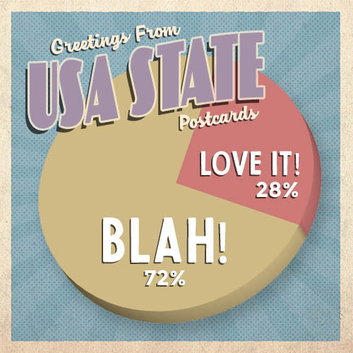
In our previous newsletter a few weeks ago, I asked your opinion regarding the color scheme and design of our "Greetings From USA State" postcard series.
Wow, the feedback came flooding in—and it was eye-opening!

For those in favor of keeping the muted retro colors, a summary of feedback included:
- "Please don't change the retro look. I get alot of positive feedback worldwide about the retro look."
- "I really like the muted retro vibe."
- "I like them the way they are."
For those NOT in favor, the feedback was loud-and-clear:
- "Do not like the state greeting cards. People like to see pictures. Like the state bird and flower etc or other famous food and landmark."
- "The first time I saw these cards I thought they were boring. I still do."
- "I can't stand the retro look nor the colors!"
- "I don't buy them because honestly I think they are just blah."
- "I have always thought the state cards were too muted and understated."
- "I don't like the muted retro colors at all. Some on the combinations seem downright ugly to me. At best they're blah."
- "I don't like your state postcards at all!"
In addition, many ideas were shared on how to make these postcards more interesting, including adding the state bird, flower, flag, etc.
The next step is to pour over all the feedback and ideas received and come up with a redesign—which we'll share in a future newsletter.
Thanks again to everyone who replied with feedback!

