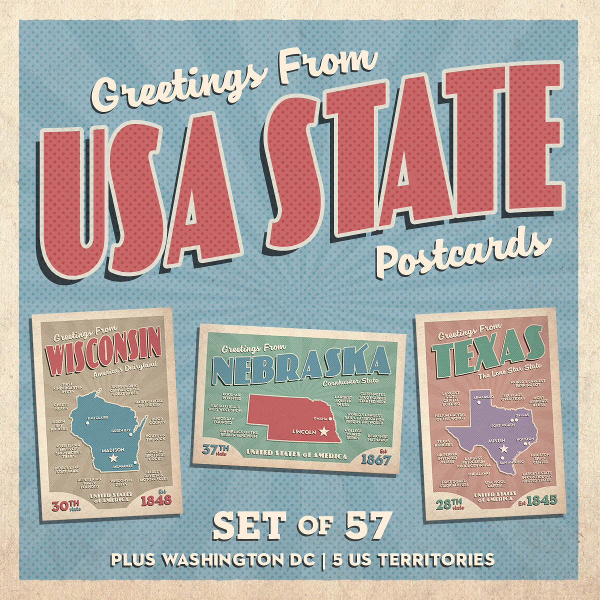
Back in August 2018 we released our "Greetings From USA State" postcard series which included all 50 states, Washington D.C., and the 5 US Territories.
I designed them to have a 1950's retro style using colors from that era. The postcard color scheme rotated between between blue, purple, redish, tan, and green as shown below:

Rotating the colors seemed like a good idea at the time so the postcard set didn't become monotonous.
However, having sold these postcards now for the past 3 years I've discovered very few sets are sold. In fact, only 20 complete sets have been purchased.
Since so few sets are sold, rotating the colors doesn't seem to be as important as I thought it might.

I tell you all this because I personally do not like how the purple and redish postcards look and cringe every time I look at them. In my opinion, they're blah.
One idea I had was for all the postcards to use the blue background (more patriotic). In addition, the state shape would be filled with the state flag — like we did for the Texas 175th anniversary last year:


